
Tutorials
Video killed the Radio Star
Discover how to effectively test video ads second by second with synthetic users, gaining valuable insights through real-time reactions and interviews.
Test a video before media spend. Synthetic participants watch, react, and can drop off, then explain what they took away, combining real-time viewing behavior with qualitative insight.
One thing to be straight about before you read a single chart. The emotions in this study are self-reported by the persona-simulating model at a set of reaction beats — a handful of points per participant across the clip — not measured from a face. Between those beats, the curves are interpolated, and the Overview tells you exactly how many beats it had to work with. The same applies to the gaze overlay further down: it's a prediction of where attention sits in the frame, not eye-tracking. Read the traces as a well-grounded simulation of viewer response, which is exactly what they're useful for, and not as physiological measurement.
1. Add the concept and upload the clip
Where to find it. Open the study planner and add a Concept node. The panel on the left holds a title, an optional description, and a Media dropzone. Until the media is in place the node reads Incomplete, and the guide in the top-left corner keeps Complete Concept details unticked.
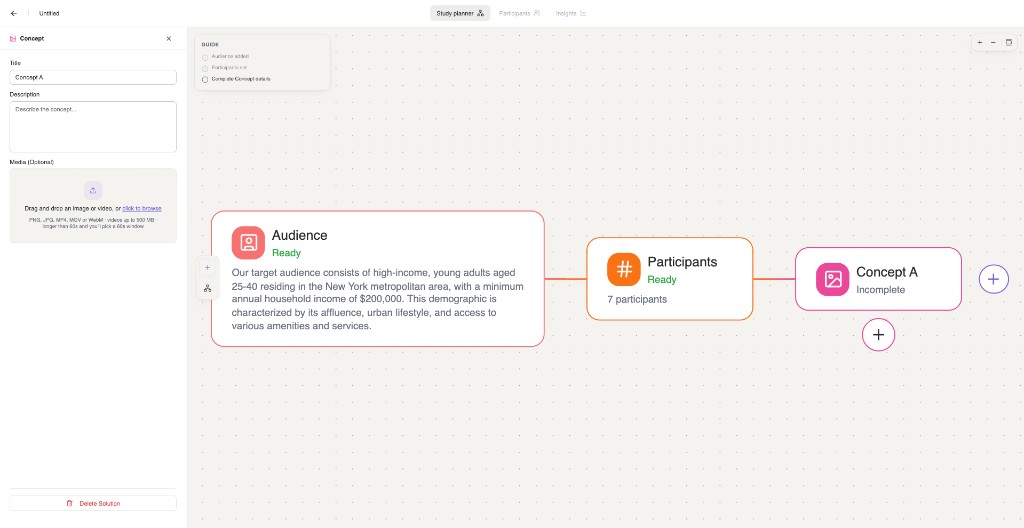
What you can upload. The dropzone accepts PNG, JPG, MP4, MOV or WebM, videos up to 500 MB, and clips up to five minutes long. The part worth knowing: only 60 seconds get analysed. If your file runs longer, a trim dialog opens — Trim to a 60-second window — and you pick the stretch the synthetic users will watch. Choose deliberately, because that window is the whole study. For a 30-second pre-roll this never comes up.
2. Let the clip get read
Once the upload finishes, the video goes through analysis before anybody watches it. The panel shows a progress bar with a rough time remaining, and the canvas node reads Analyzing video…. You can keep editing the rest of the study while it works, but it can't run until the concept is Ready.
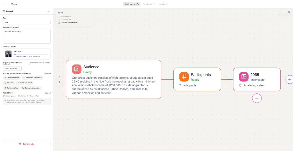
This step is doing real work: it gives the model a shot-by-shot sense of the clip, and it surfaces the brands it can see on screen, which feeds the brand awareness setting in a moment.
3. Three optional settings that change what you learn
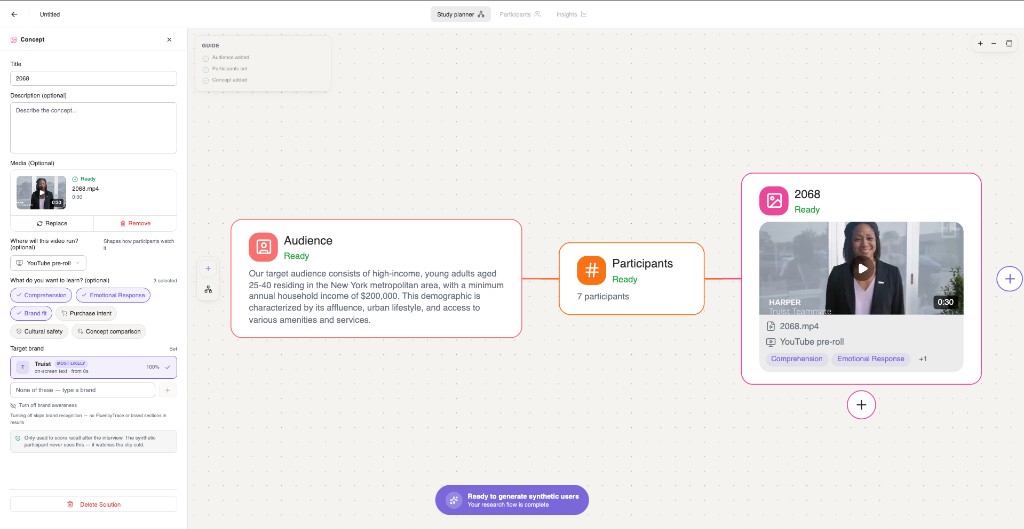
Where will this video run?
The channel picker shapes how participants watch it. Options are Instagram Feed, Short-form content, Instagram Stories, YouTube pre-roll, LinkedIn, TV and Other. This matters more than it looks. Someone on a pre-roll has a thumb hovering over the skip button and about five seconds of patience; someone watching the same cut on TV has neither the option nor the impulse. Pick the channel you're actually buying, and the drop-off you see will mean something.
What do you want to learn?
Six goals, and you can select as many as apply: Comprehension, Emotional Response, Brand fit, Purchase intent, Cultural safety and Concept comparison. These steer what the post-watch interview digs into and which sections the report leans on.
One caveat the panel will tell you itself: Concept comparison needs at least two video concepts. With a second concept added, every participant watches both, the interview closes head-to-head, and the report compares them directly. On a single-concept study it's quietly ignored, so add the second concept if that's the question you're asking.
Brand awareness
This one is off by default, and the panel describes it plainly: measure whether participants recall the brand — unaided. Turn it on and, once analysis has finished, the brands detected in the clip appear as candidates — the strongest carries a MOST LIKELY badge along with where it first shows up on screen. If none of them is right, type the brand yourself.
The important detail sits directly under the field: Only used to score recall after the interview. The synthetic participant never sees this — it watches the clip cold. Naming the brand doesn't prime anybody; it just tells us what a correct answer looks like when we ask afterwards.
You can turn it back off, with a consequence: turning off skips brand recognition — no FluencyTrace or brand sections in results. So if brand linkage is part of the decision you're making, leave it on.
4. Run it
When the audience, the participants and the concept are all Ready, Ready to generate synthetic users appears at the bottom of the canvas. From there the run proceeds like any other study.
5. Reading the watch: Playback
When the interviews are done, open Insights → Summary. A video study gives you two modes there: Overview for the analytical read, and Playback to scrub the clip and read every participant at that moment. Start with Playback — it's the closest thing to sitting behind a one-way mirror.
Under the video sit four traces you can switch between. The caption above each one always tells you the value at the current playhead, so the number you're reading is anchored to the frame you're looking at.
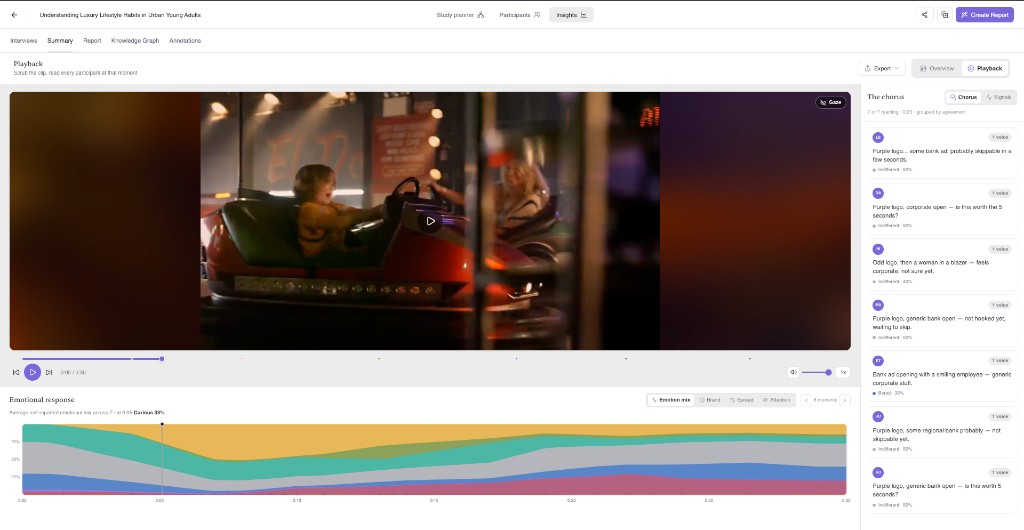
Emotional response
The average self-reported emotional mix across everyone, stacked over time. The vocabulary here is viewer-state rather than clinical: amused, curious, moved, indifferent, bored, skeptical, confused, irritated.
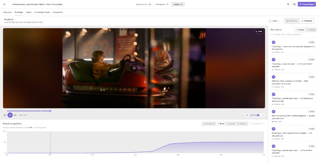
Brand recognition
Average unaided recognition over the clip, plus how many people have recognised the brand by that point. The flat stretch at the start followed by a rise is the single most informative shape in a branded video test: it's the cost, in seconds, of your brand reveal.
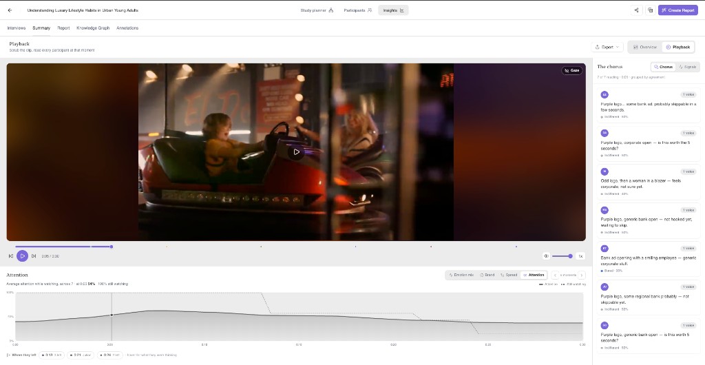
Attention
Average attention among the people still watching, with a dashed line for how many are still watching at all. The two together separate a clip people are ignoring from a clip people have left.
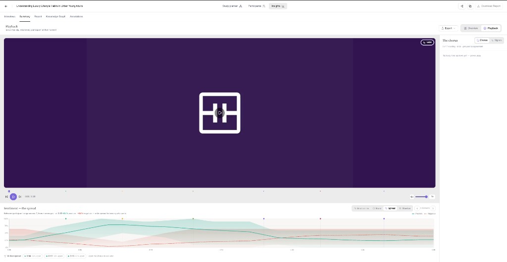
Sentiment — the spread
Positive and negative envelopes across participants, rather than a single average — useful for spotting a clip that splits an audience instead of mildly pleasing it. It needs at least four participants before the spread means anything.
The chorus, and the gaze overlay
On the right, The chorus shows what every participant is thinking at the playhead, clustered by agreement — so you can see at a glance whether seven out of seven said the same thing or the room split four to three. Toggle to Signals for the aggregate view of the same moment: emotion mix, recognition, and who has crossed the line.
The Gaze pill on the video turns on a heatmap of predicted attention within the frame. It's genuinely useful for checking whether your logo is sitting where nobody is looking — bearing in mind it's a prediction, as noted at the top.
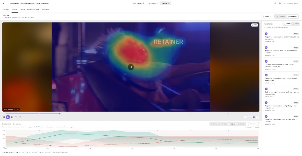
6. Reading the verdict: Overview
Switch to Overview and the same run is reframed as a scorecard, opening with a written summary of what happened.
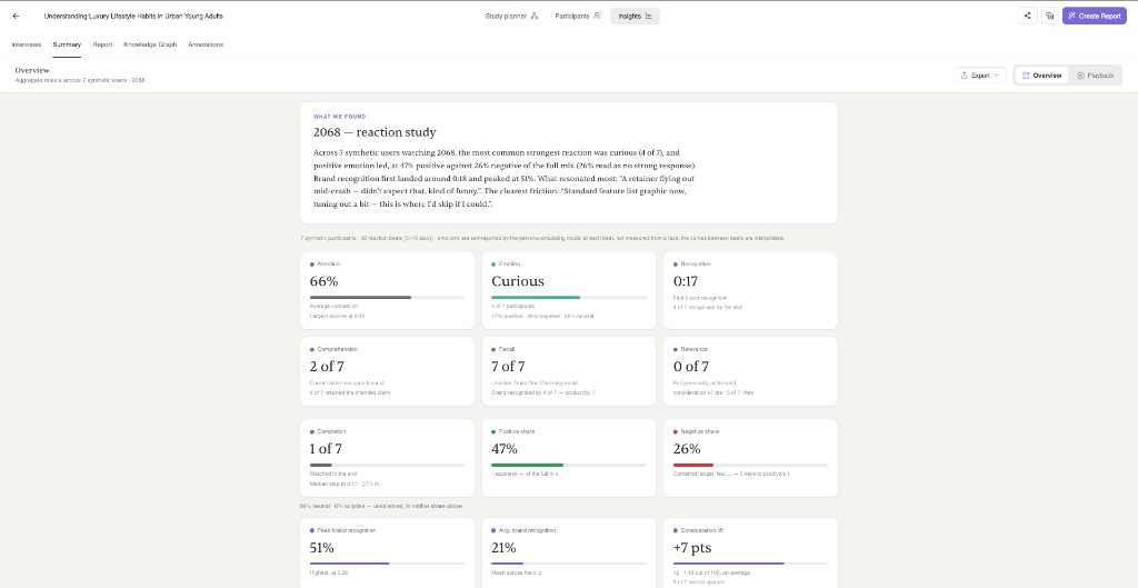
What each tile is actually telling you:
- Attention — the average share of the clip that got watched, with the point of steepest decline called out.
- Emotion — the strongest reaction most participants landed on, and how many of them shared it. If nothing clears the floor, it says so rather than inventing a mood.
- Recognition — the moment average unaided recognition first crossed the line, and how many people got there by the end.
- Comprehension — how many took away the intended main message. Kept deliberately separate from whether they believed it.
- Recall — unaided brand or product recall, scored after the interview.
- Relevance — how many felt personally addressed by the ad.
- Completion — how many reached the end, alongside the median stopping point for those who didn't.
- Positive and negative share — the time-weighted split of the emotional mix. These won't add up to 100%, and that's correct: neutral and surprise are unvalenced and sit in neither.
- Peak and average brand recognition, and consideration lift — the last of these compares a post-view score against a pre-exposure baseline, out of 100, and tells you how many people moved upward.
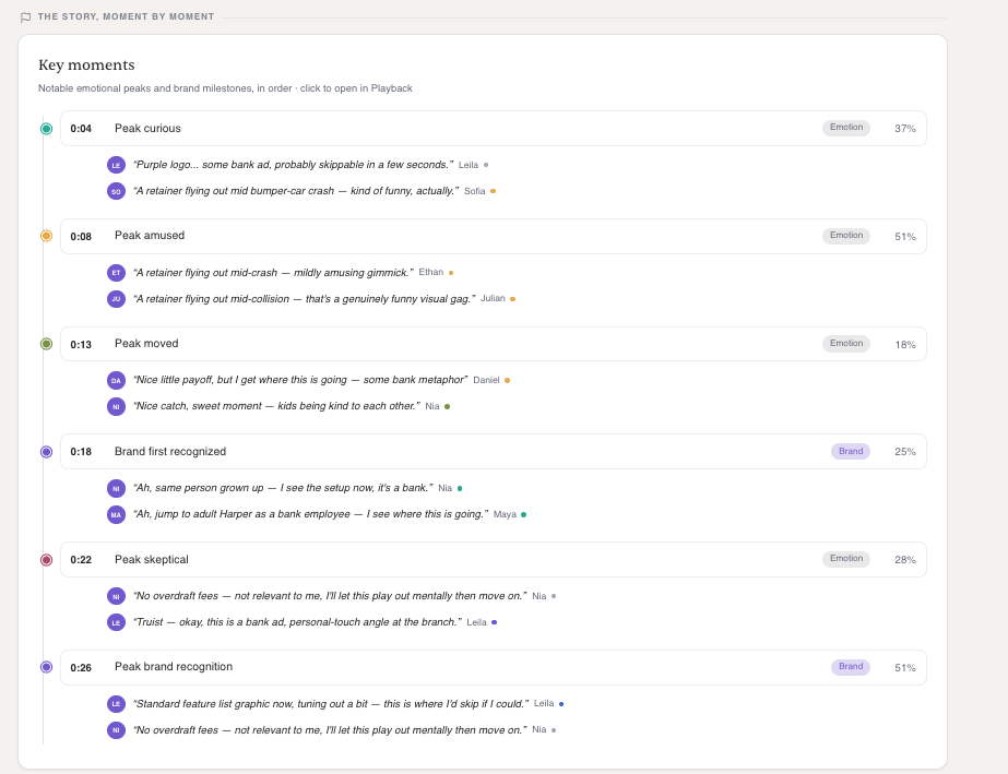
Below the scorecard, Key moments lays the clip out as a sequence of emotional peaks and brand milestones, each carrying the verbatims that define it. Clicking any of them drops you into Playback at that second.
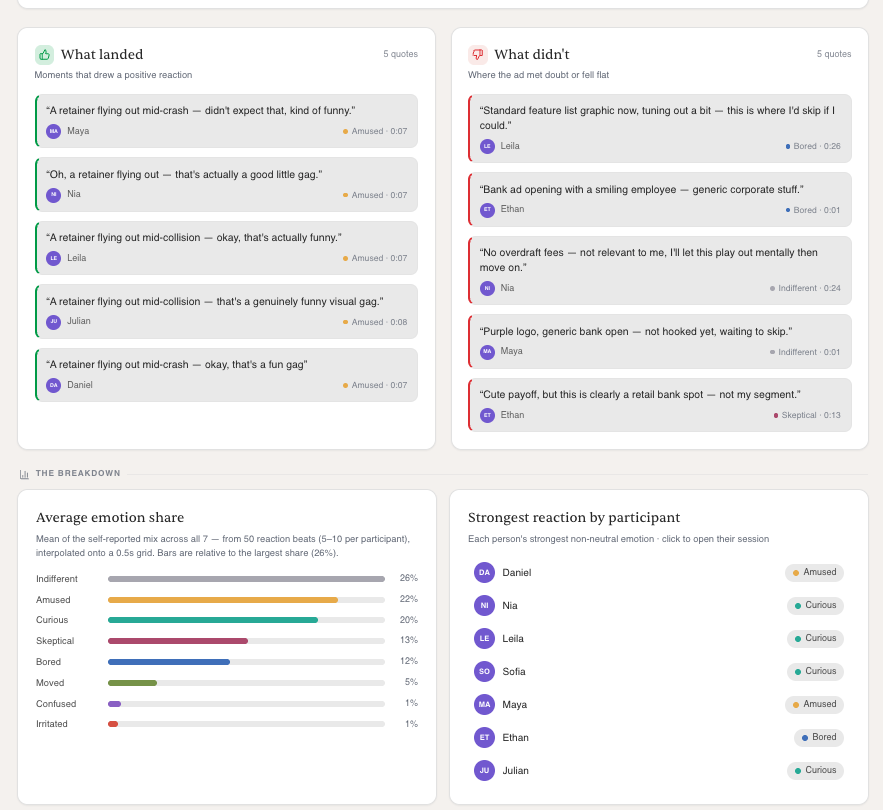
Then the verbatim reels. What landed and What didn't pull the moments that drew a positive reaction and the moments where the ad met doubt or fell flat, each stamped with who said it, what they were feeling, and when. Underneath, the average emotion share and each person's strongest reaction — click a name to open their session.
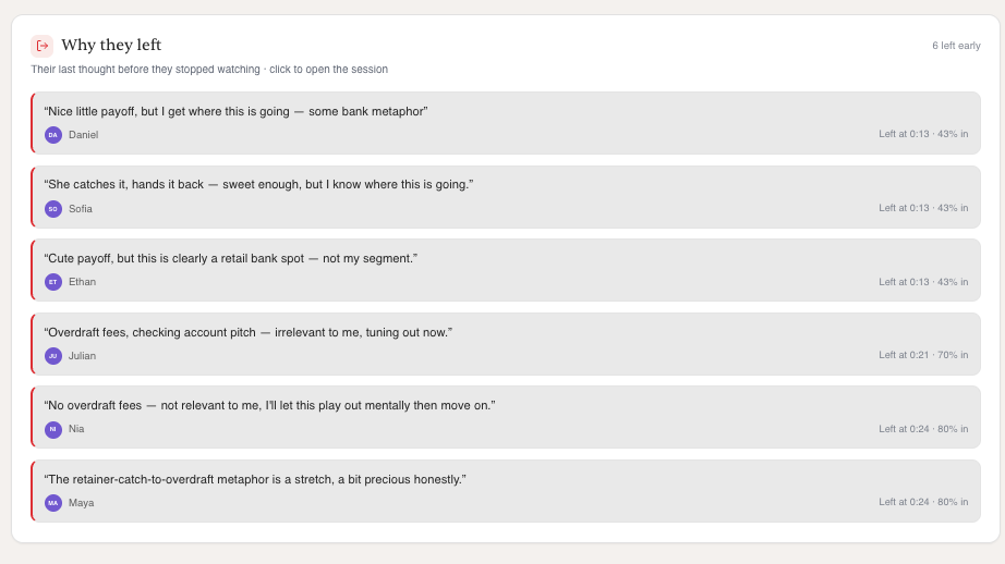
If you only look at one panel in a pre-roll test, make it Why they left: the last thought each person had before they stopped watching, with the timestamp and how far in they got.
7. Turn it into a report
Hit Create Report and you get an outline before anything is written. Drag to reorder, remove what you don't need, or add a custom section by describing what you want and letting the agent write it.
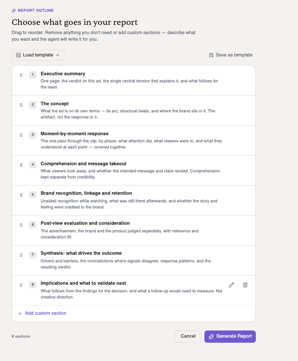
The default spine for a video study, in order:
- Executive summary — the verdict on this ad, the central tension that explains it, and what follows for the team.
- The concept — what the ad is on its own terms: its arc, its structural beats, and where the brand sits in it.
- Moment-by-moment response — one pass through the clip by phase: what attention did, what viewers were in, and what they understood at each point.
- Comprehension and message takeout — what viewers took away, and whether the intended claim landed. Comprehension kept separate from credibility.
- Brand recognition, linkage and retention — recognition while watching, what was still there afterwards, and whether the story and feeling got credited to the brand.
- Post-view evaluation and consideration — the ad, the brand and the product judged separately, with relevance and consideration lift.
- Synthesis: what drives the outcome — drivers and barriers, the contradictions where signals disagree, response patterns, and the resulting verdict.
- Implications and what to validate next — what follows for the decision, and what a follow-up would need to measure.
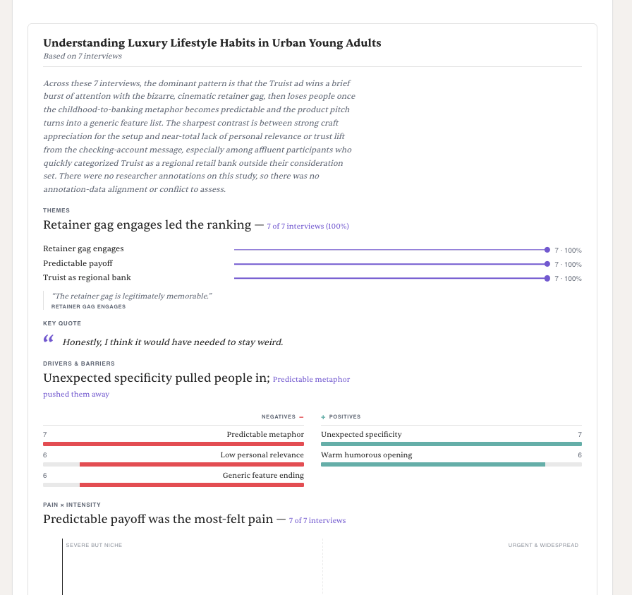
The generated report brings the qualitative analysis in alongside the reaction data: themes ranked by how many interviews carried them, a key quote, drivers and barriers side by side.
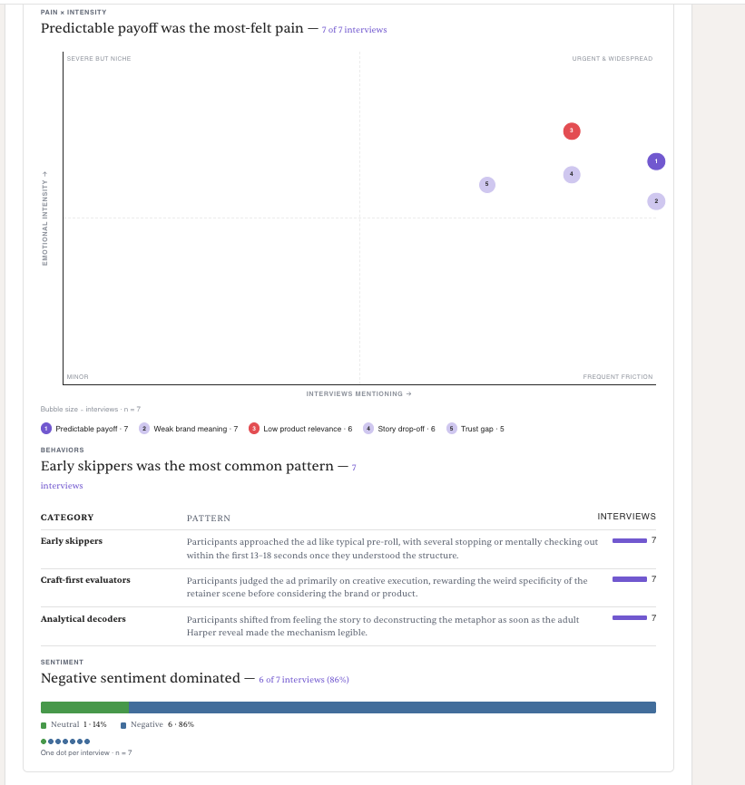
And further down, the pain-by-intensity plot, the behavioural patterns the run produced, and the sentiment split.
Questions? Book time with our team, or email us at support@syntheticusers.com.