
Tutorials
Study Summaries
Quickly grasp interview insights with the Summary tab, featuring sentiment analysis, key quotes, and pain points for immediate value before custom reporting.
It reads every interview and shows what actually mattered
The Summary isn’t a fixed template you fill in. It reads across the whole set of interviews, works out which patterns are strong enough to matter, quantifies them, and lays them out in one view, most important first. No two studies produce the same Summary: the sections you see, and the order they appear in, follow whatever the interviews actually surfaced. A section only shows up when there’s something real behind it.
In the study below, people mostly described what they do and why so the Summary opened with a plain-language overview, then led with the themes and behaviors that carried the most weight, and grounded them in a representative quote.
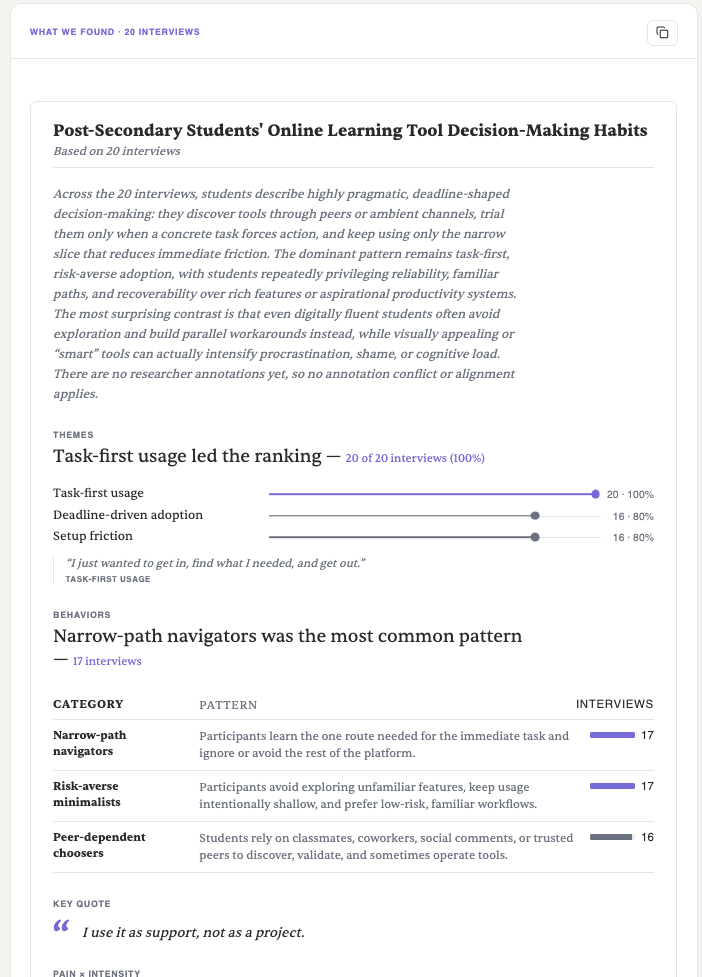
- Overview A written read of the whole study in plain language: what was found, how many interviews back it, and the dominant pattern. Always the starting point, the sections beneath it are where you inspect the parts.
- Themes The topics that recurred across interviews, ranked by reach, with a count like “16 · 80%.” Only patterns that actually repeated appear here, a study with no strong shared topics simply won’t lead with themes.
- Behaviors Named patterns in what people actually did, each with a short description and the number of interviews it appeared in. Themes are what people talked about; behaviors are what they did.
- Key quote A representative line pulled straight from an interview and tagged to the theme it illustrates, the numbers, given a voice.
Because the layout is driven by the interviews, another study might open on pains, sentiment, or the tensions people felt instead, each section shows up only when there’s something real behind it.
The attention heatmap
When a study tests a concept, an image or design rather than a live product, the summary adds an attention heatmap. It predicts where each synthetic participant would look, based on who they are and what they told you.
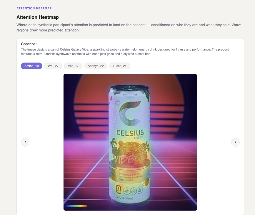
- Concept The stimulus being tested, with a short description of what it is. Concept tests run against an image or design instead of a live product.
- Participants Each synthetic participant, by name and age. Switch between them to see how attention shifts from person to person, conditioned on who they are and what they said.
- Heatmap A prediction of where that participant’s attention lands on the concept. Warm regions drew more predicted attention; cool regions drew less.
- Intensity scale The colour key, running from low attention to high, for reading the overlay.
The gaze map, screen by screen
When a study puts participants through a live experience, a website, a flow, a prototype, the gaze map shows where their attention settled on each screen, next to what they said as they moved through it. Where the concept heatmap reads a single image, this reads a whole walkthrough.
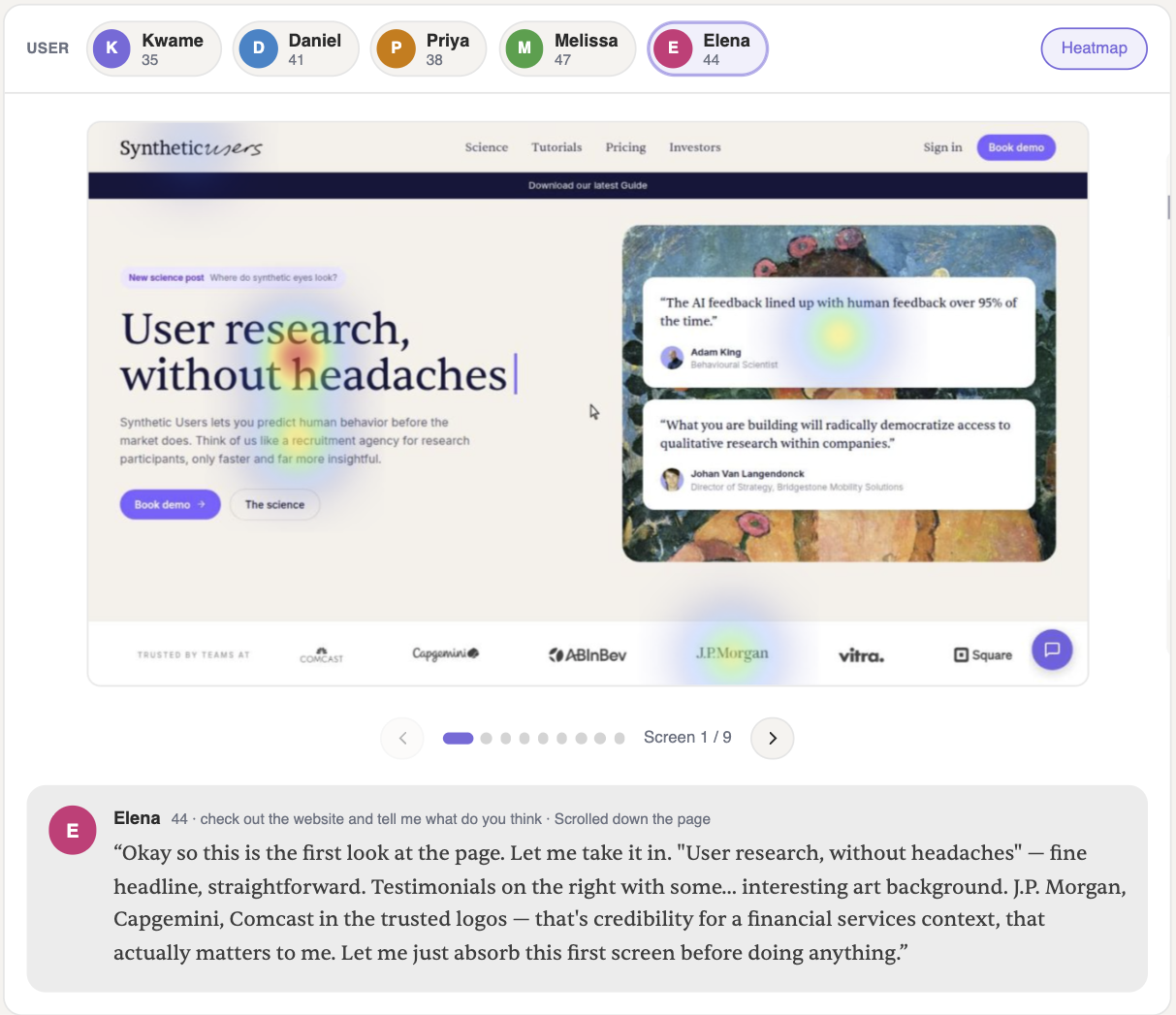
- Participants Everyone in the walkthrough, by name and age. Select one to load their session, here, Elena is active.
- Heatmap toggle Turn the gaze overlay on or off to switch between the plain screen and where attention landed.
- Gaze map Warm regions show where this participant’s attention concentrated on the current screen, here, the headline, the top testimonial, and the J.P. Morgan logo.
- Screens The walkthrough is split into screens (1 of 9 here). Step through with the arrows to follow attention across the whole session.
- Think-aloud The participant’s verbatim reaction to the screen, with the task they were given and what they did (“Scrolled down the page”), the “why” behind the heatmap.
The same screen tells a different story depending on who’s looking. Switch participants with the chips at the top, then step through the screens to compare.
Summary is a read, not a report. Once you have the shape of the study, move to the Report tab to build something you can share.